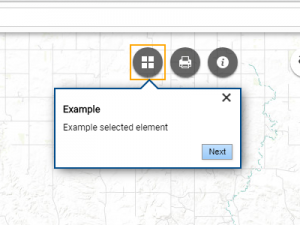
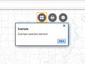
The Tour Settings control how your Tour is displayed to the end user. This is separated into two panels. Style Effects Panel controls how the geoSherpa widget/module is displayed. The Effects Panel controls how geoSherpa highlights your web GIS application.
These settings can change all the Tour Steps individual styles or only for new Tour Steps as they are created. As a reminder, each Tour Step can be individually styled the same way.
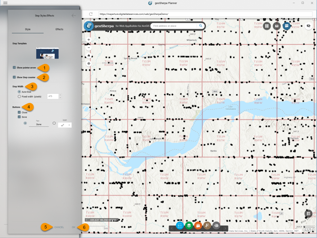
Style Panel
1. Show Pointer Arrow
2. Show Step Counter
This controls the step illustration on the tip. The options are Dots or Textual.
3. Step Width
4. Buttons
5. Cancel
6. OK
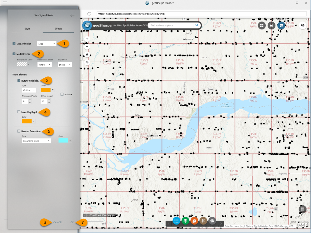
Effects Panel
1. Step Animation
This controls how one Tour Step transitions to another. The options are:
- Slide
- Fade
- Slide / Fade
2. Modal Overlay
The Modal Overlay controls how a modal dialog overlays the web application.
- Background Color controls the color of the web application mask.
- Modal-Click Effect controls how the web application reacts to clicks outside the modal dialog. The options are:
- None
- Ripple (default)
- Bubble
- Particles
- Flash
- Step Effect controls how the modal dialog reacts to clicks outside of the modal dialog. The options are:
- None
- Shake (default)
- Bounce
3. Target Element - Border Highlight
The Border Highlight defines how the target element is highlighted on the web application. The options are:
- Type controls how the target element is surrounded. The options are:
- Color sets the color of the border highlight.
- Thickness (Pixels) set the thickness of the highlight in pixels.
- Offset (Pixels) sets the offset, outside, of the target element.
- Animate checkbox
4. Target Element - Inner Highlight
The Inner Highlight sets the color an highlight inside the target element.
5. Target Element - Beacon Animation
This sets the default style of the Beacon Animation or how the element is highlighted on the web application. The Type options are:
- Expanding Circle
- Expanding Circles (Multiple)
- Collapsing Circle
- Collapsing Circles (Multiple)


